# 命名空间
There are only two hard things in Computer Science: cache invalidation and naming things.
– Phil Karlton
计算机科学的两件难事:缓存失效和命名。
命名是一件复杂,有挑战的事,尤其是还需要使用英文。 在名称尽量短的情况下,还需要清晰、准确的指明当前内容的功用。 清晰明确在多数时间又是冲突的, 但是为了实际应用,使其成为了一个俗成的约定,因而也出现了各种命名的流派。
团队之间设定规则,并遵循规则命名、编码,以提升整体工作效率,尽量避免理解偏差。 终极目标是以最简洁的命名让更多的人通过命名可以对对应的内容有准确的预期。语义化的、和通用性的简写方式是其中重要的原则。
以下分享一些规范命名的样本,和流行的命名规则:
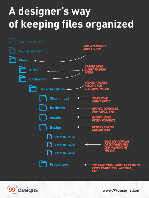
# 文件夹(项目)
主要用于个人文件,项目共享文件夹管理。 例如团队使用的seafile 内的文件管理。
参照 : File naming convertion (opens new window)
命名示例:
根据项目的情况和团队情况灵活设计,保证文件夹的语义化、可读性。
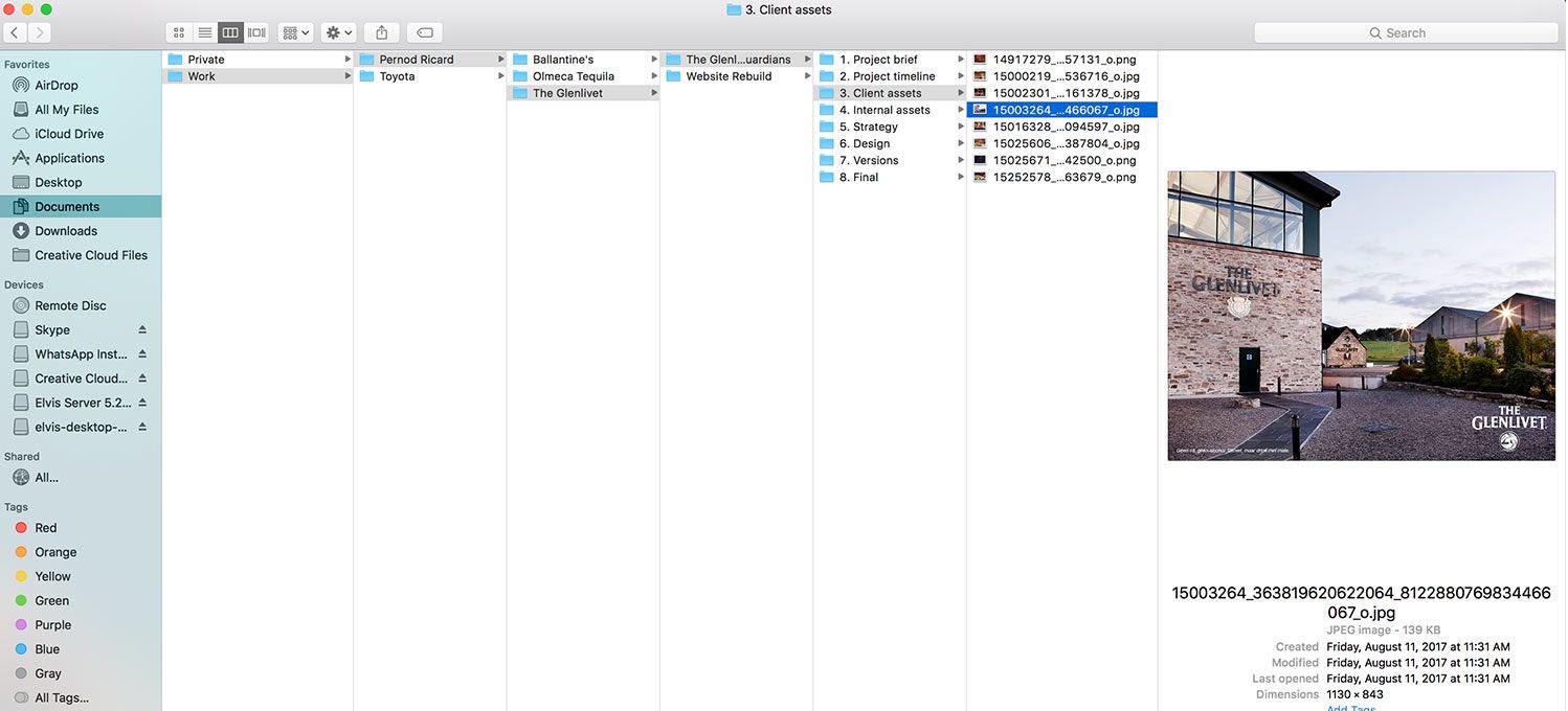
# 流程、交互&设计交付
主要用于团队内部的流程、交互 & 设计交付使用,用于提升使用体验,减少不必要的沟通以及由此带来的额外负面影响。
可以绘制如下图的架构图,便于团队沟通。 简单团队的交付文件命名规范见 Zeplin命名管理
# 文件内(图层、css等)
主要用于设计师的设计源文件,保持良好的命名、分组习惯,提升设计效率和质量。 使文件可维护,便于团队协作的可操作性。
设计、前端不分家,良好的协作习惯能大大提高整体工作效率,减少不必要的沟通和错误,设计命名通常很少被提及,但在前端领域却有这深入的研究,在前端设计中, BEM 命名方式可圈可点,其设计思想也很有参考价值,至今仍被众多大公司和优秀的团队改编、应用。 同样也适用于设计领域。
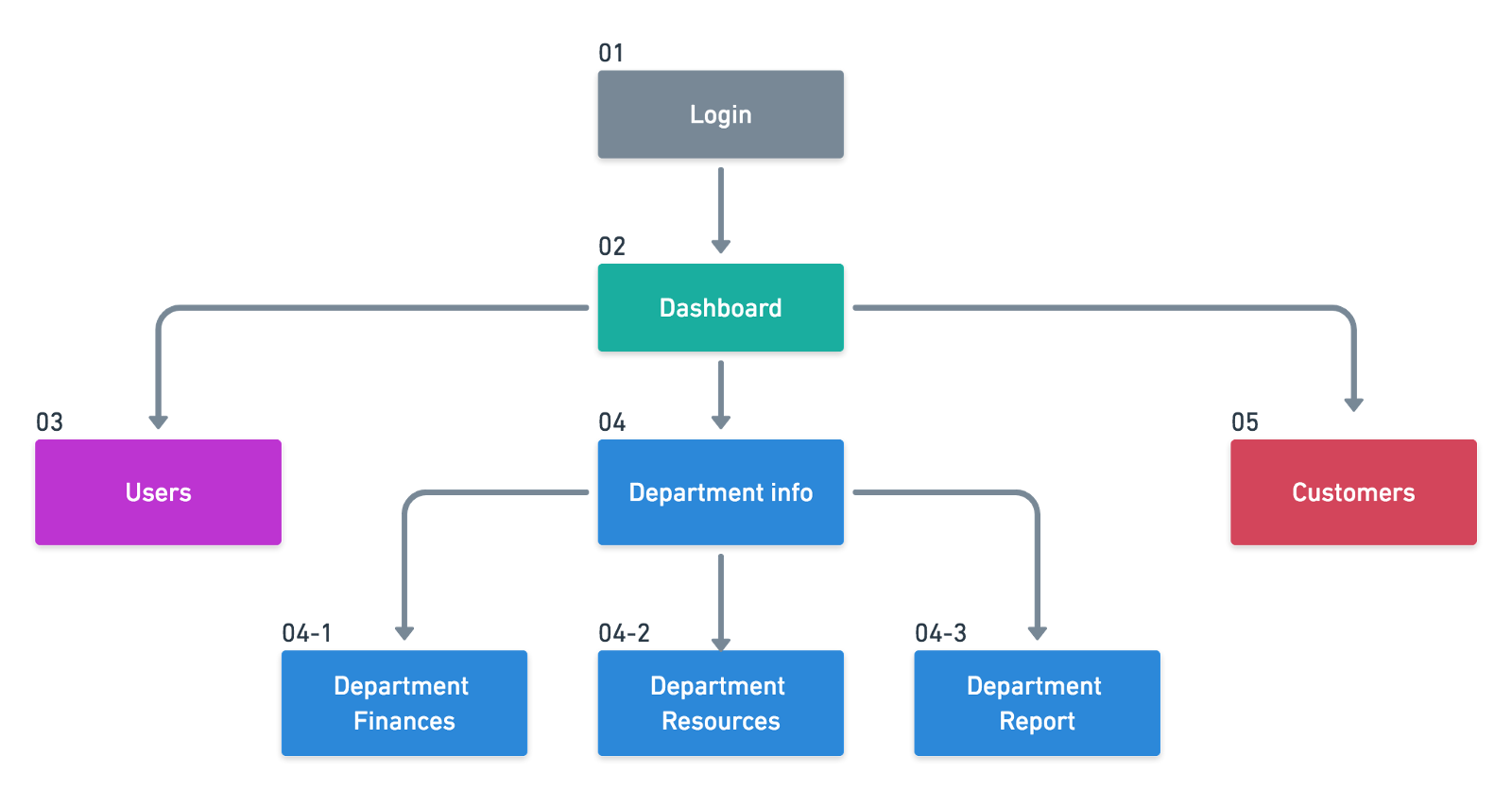
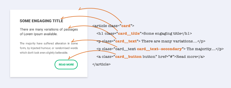
# BEM
使用 BEM 命名规范,理论上讲,每行 css 代码都只有一个选择器。
BEM代表 “块(block),元素(element),修饰符(modifier)”,我们常用这三个实体开发组件。
- 块
独立的实体,它本身是有意义的。
例:header,container,menu,checkbox,input
- 元素
块的一部分,没有独立的含义,并且在语义上与其块相关联。
例:menu item,list item,checkbox caption,header title
- 修饰符
块或元素上的标志。用它们来改变外观或行为。
例:disabled,highlighted,checked,fixed,size big,color yellow
在选择器中,由以下三种符号来表示扩展的关系:
- 中划线 :仅作为连字符使用,表示某个块或者某个子元素的多单词之间的连接记号。
__ 双下划线:双下划线用来连接块和块的子元素
_ 单下划线:单下划线用来描述一个块或者块的子元素的一种状态
BEM示例:
type-block__element_modifier
命名解析:
命名实例:
# ABEM
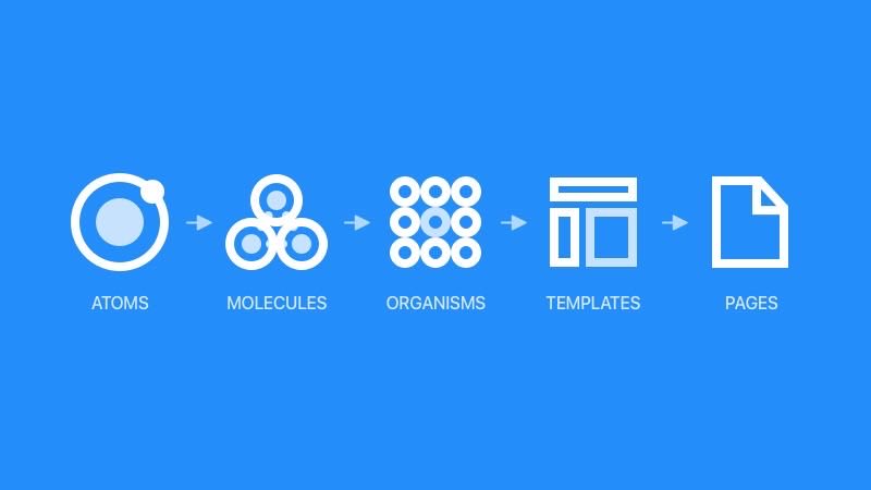
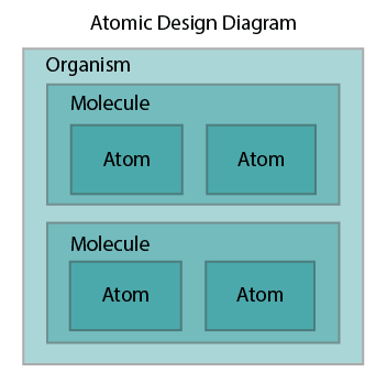
结合Atomic design 原子设计理论 (opens new window) 和BEM命名方法的命名方式。
2013 年前端工程师 Brad Forst 将此理论运用在界面设计中,形成一套设计系统,包含 5 个层面:原子、分子、组织、模板、页面。
- 原子
为网页构成的基本元素。例如标签、输入,或是一个按钮,也可以为抽象的概念,例如字体、色调等。 - 分子
由原子构成的简单UI组件。例如,一个表单标签,搜索框和按钮共同打造了一个搜索表单分子。 - 组织
由原子及分子组成的相对复杂的UI构成物 。 - 模板
将以上元素进行排版,显示设计的底层内容结构。 - 页面
将实际内容(图片、文章等)套件在特定模板,页面是模板的具体实例。
# atomic 理论框架
# 原子设计结构图
atomic design 的 [a,m,o]
# 原子设计前缀 + BEM

# 原子设计前缀 + 驼峰式BEM 推荐设计师使用

# BEM 其他前缀命名参考
实际应用当中不同的项目、团队和实际情况不太,也可以灵活拓展BEM命名方式,比如以下两种命名前缀,可供参考:
| Type | Prefix | Examples | Description |
|---|---|---|---|
| Component | c- | c-card c-checklist | Form the backbone of an application and contain all of the cosmetics for a standalone component. |
| Layout module | l- | l-grid l-container | These modules have no cosmetics and are purely used to position c- components and structure an application’s layout. |
| Helpers | h- | h-show h-hide | These utility classes have a single function, often using !important to boost their specificity. (Commonly used for positioning or visibility.) |
| States | is- has- | is-visible has-loaded | Indicate different states that a c- component can have. More detail on this concept can be found inside problem 6 below, but |
| type | prefix | Description |
|---|---|---|
| Object | o- | Signify that something is an Object, and that it may be used in any number of unrelated contexts to the one you can currently see it in. Making modifications to these types of class could potentially have knock-on effects in a lot of other unrelated places. Tread carefully. |
| Component | c- | Signify that something is a Component. This is a concrete, implementation-specific piece of UI. All of the changes you make to its styles should be detectable in the context you’re currently looking at. Modifying these styles should be safe and have no side effects. |
| utility | u- | Signify that this class is a Utility class. It has a very specific role (often providing only one declaration) and should not be bound onto or changed. It can be reused and is not tied to any specific piece of UI. You will probably recognise this namespace from libraries and methodologies like SUIT. |
| theme | t- | Signify that a class is responsible for adding a Theme to a view. It lets us know that UI Components’ current cosmetic appearance may be due to the presence of a theme. |
| states | is-, has- | Signify that the piece of UI in question is currently styled a certain way because of a state or condition. This stateful namespace is gorgeous, and comes from SMACSS. It tells us that the DOM currently has a temporary, optional, or short-lived style applied to it due to a certain state being invoked. |
| hack | _ | Signify that this class is the worst of the worst—a hack! Sometimes, although incredibly rarely, we need to add a class in our markup in order to force something to work. If we do this, we need to let others know that this class is less than ideal, and hopefully temporary (i.e. do not bind onto this). |
| javascript | js- | Signify that this piece of the DOM has some behaviour acting upon it, and that JavaScript binds onto it to provide that behaviour. If you’re not a developer working with JavaScript, leave these well alone. |
| QA | qa- | Signify that a QA or Test Engineering team is running an automated UI test which needs to find or bind onto these parts of the DOM. Like the JavaScript namespace, this basically just reserves hooks in the DOM for non-CSS purposes. |
# 命名工具
命名虽复杂,但可以合理利用工具提升设计效率,减轻工作量。
# Sketch 插件
- sortme (opens new window) 根据命名排序的小工具,轻量、必备。
- renameit (opens new window) 命名神器,必备。
- replace2 (opens new window) 查找替换图层内的内容。
# 翻译工具
- 变量命名神器 (opens new window) 支持直接搜索中文,当你查中文的时候,Codelf 会直接查好单词和单词的近义词给你,然后再搜索Github, Bitbucket, Google Code, Codeplex, Sourceforge, Fedora Project上的开源项目的源码匹配出与这些词汇相关的变量名和函数名。
- iTranslate (opens new window) 使用 iTranslate for Mac,超过 80 种语言尽在您指尖。它是一款状态栏 app,您只需点按鼠标或敲击键盘,它就可帮您解决一切翻译问题。
- 划词翻译-chrome插件 (opens new window) 让浏览任意语言的网站变得无比轻松的浏览器扩展程序。
# 语义化版本
※ 使用 Semantic Versioning (opens new window) 2.0.0 语义化版本规范。

——《论语》